PROJECT
Southbound Brewing Rebrand and Beer Package Design | Beer Branding
SERVICES
BREWERY LOGO DESIGN
BEER PACKAGE DESIGN
BREWERY APPAREL
ILLUSTRATION
TAP HANDLE DESIGN
SELL SHEET & KEG COLLAR DESIGN
The Challenge:
Southbound Brewing looked to us to redefine their visual identity and package design to fit the modern consumer, while staying true to their passion of great music, great company, and great beer.
Execution:
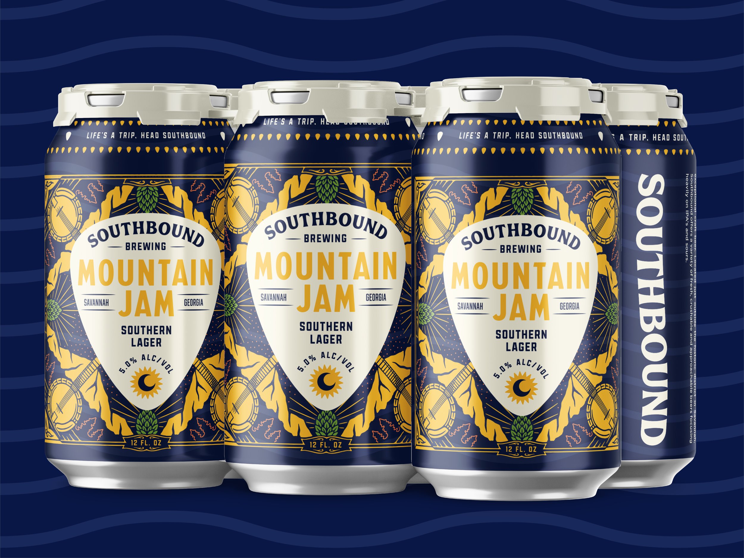
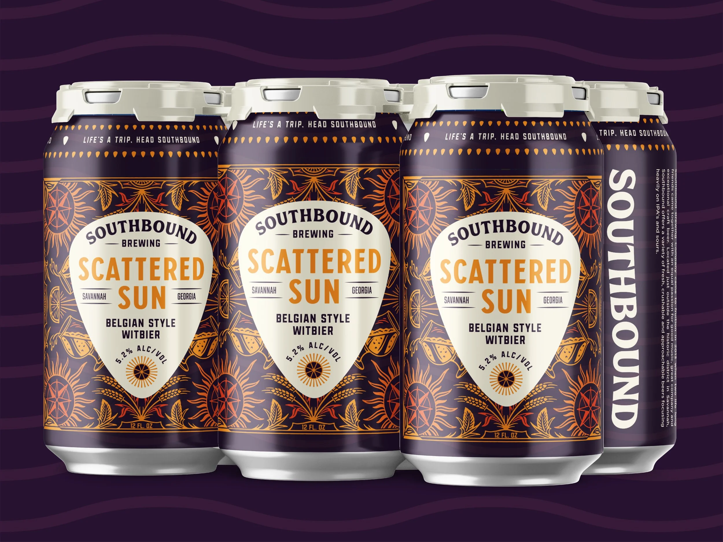
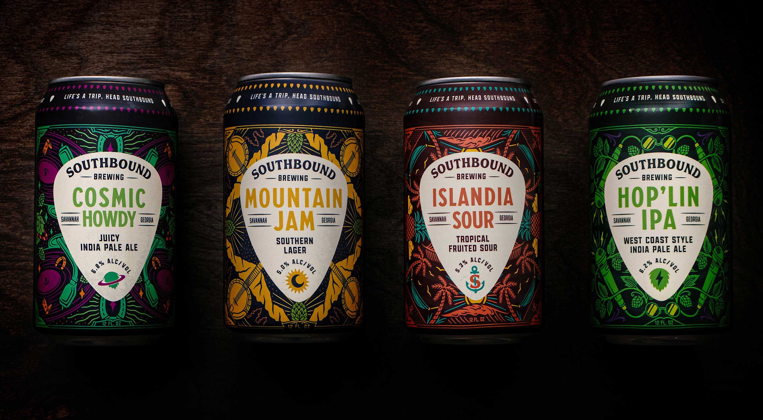
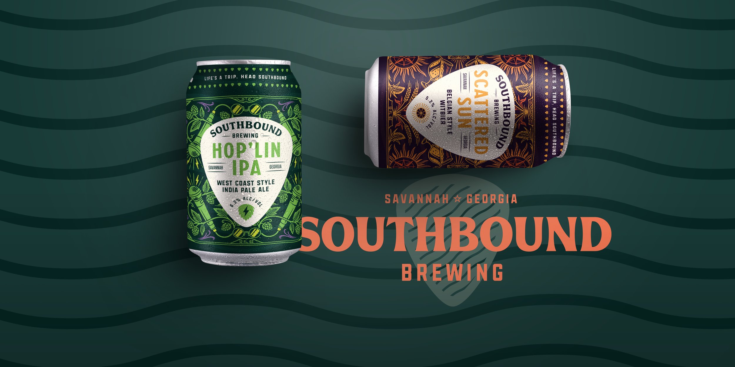
We first established a new visual identity that gives nods to the funk and groove of the brand. We then carried this over to the package design system, featuring the guitar pick-esque shape, pointing south, sitting on top of a custom background illustration. This clear separation from the background allows for the kaleidoscopic and expressive custom illustrations to showcase the passion and liveliness of the brewery, while still creating a memorable and own-able label system.
THE BREWERY REBRAND
Life’s a Trip, Head Southbound.
We set out to preserve the liveliness and character of the brewery, while creating a contemporary brand that could work in harmony with an expressive package design system.
BEER PACKAGE DESIGN
Tasked with establishing a label system that could play at larger distribution levels, we carried the shape from the identity system over onto the packaging to house all of the product information in a clear, concise, and branded way. Inspired by Southbound’s passion for live music and music festival culture, we created a custom illustration for each product that feels expressive, funky, and kaleidoscopic. With this system, each beer has a unique individual expression, while clearly recognizable as a Southbound brew.


Photos provided by SouthBound